
DURA Products has unveiled new corporate branding, featuring new house colours, logos and a new suite of company literature. The new logo’s composition of green hues is said to be visually appealing and also evoke a sense of environmental consciousness, while the varying shades of green symbolise ‘growth, vitality, and harmony with nature’.
The blocks in the logo are designed to pay tribute to the modularity of the products range, while the addition of the rounded-edge square, resembling a curb, symbolises the firm’s focus on creating ‘durable and resilient’ infrastructure.
The new brand identity is showcased in the company’s new product brochures. The documents, including a 36-page brochure for Duradrain and Durachannel, and a 20-page full-colour document for Durakerb, detail the company’s product ranges, accreditations, measurements, and guidance on system and product maintenance.
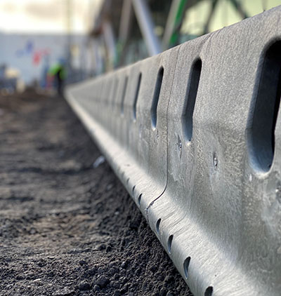
Dura added that each of the company’s three products are created out of high recycled plastic content and have low carbon outputs.
MD Steve Bennett said, “We thought it was important that our brand identity adhered more closely to our values and truly positioned us as sustainable construction innovators; an example of what construction should be in 2023.”